Glasgow vs Edinburgh for hill walkers
Which city is better for Munro bagging?
February 21, 2020Introduction
The idea for this post comes from my forthcoming free evening lecture on the Munros on March 12 2020. My talk will be a Fringe Event at Edinburgh's DataFest 2020 in March. Sign up here https://ctzn.tk/munros
The Munros are the 282 hills and mountains in Scotland higher than 3,000 feet, named after Hugh Munro who published his famous list back in 1891. Some people, lots of people in fact, try to climb them all, at which point they can submit their name to the list of 'compleators'. You don't have to tick off all of them to enjoy the Munros, and Munro-bagging is a popular pastime and, for many, a lifetime's pursuit.
I like hill walking, and I like data. I also live in Edinburgh, and I've wondered how Edinburgh compares to other places in terms of its access to the Munros, which are scattered throughout the Scottish Highlands. To find out where the optimum location for Munro-bagging is you'll need to come to my talk. In the meantime, I thought it would be fun to compare Edinburgh to its age-old rival Glasgow.
So where are the Munros then?
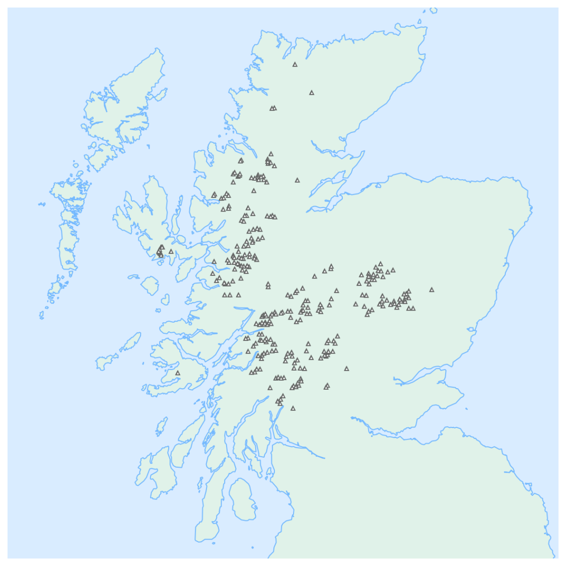
Here is a very simple map showing the 282 Munros in Scotland. As you can see, they're scattered around a bit, with major clumps along the west coast and also in the Cairngorms in the heart of Scotland. For an interactive map showing relief as well as Munros, click here. My map has the bare minimum of details, you'll see why shortly. I'm aware that it doesn't have a scale bar, north arrow or a title. Naughty.
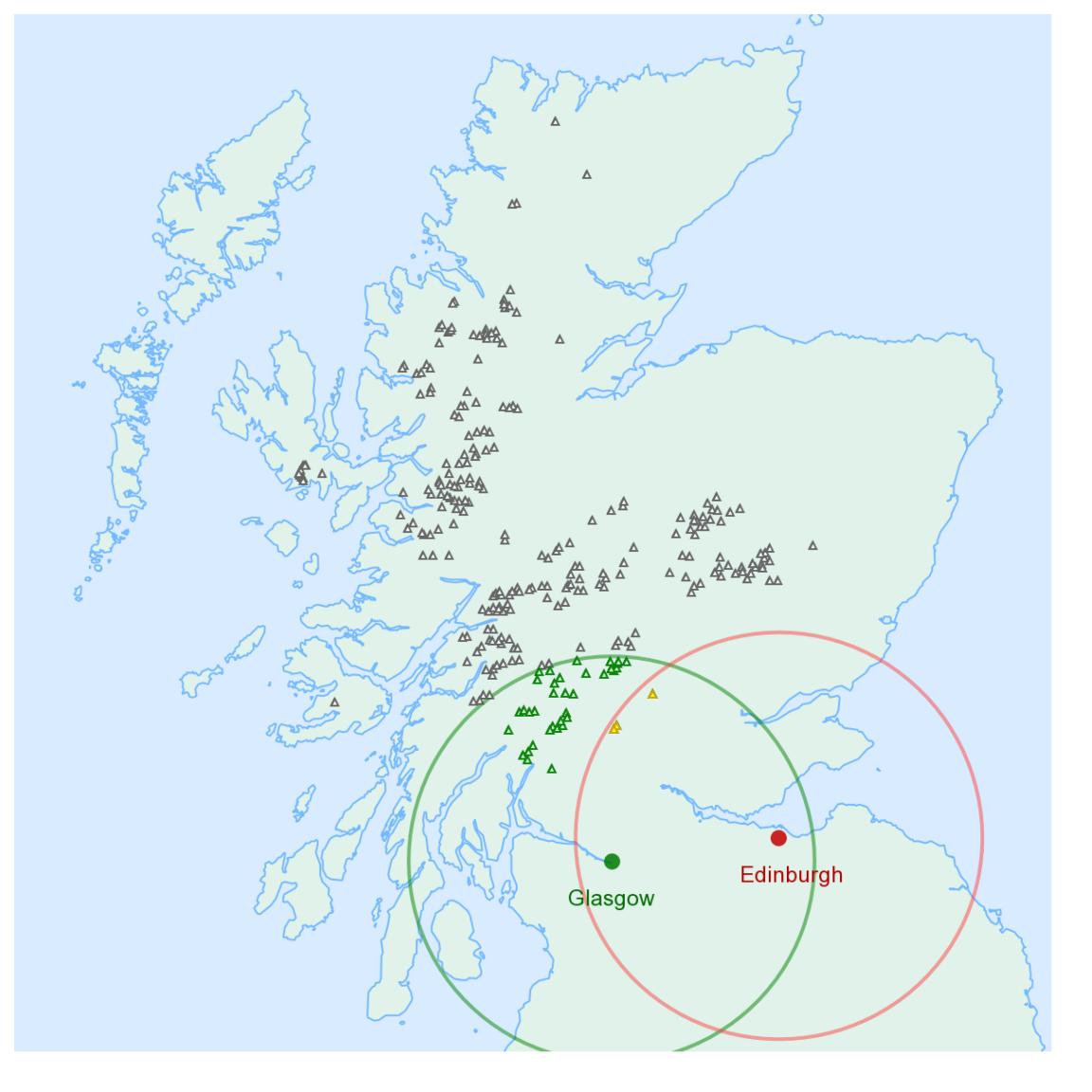
Next up is a map (below) showing the locations of Edinburgh (George Square) and Glasgow (also George Square) with a 40 mile radius around each. You can see that a bunch of Munros lie within 40 miles of Glasgow (14, in fact), whereas Edinburgh doesn't have any...yet!

What if we increase that radius to 50 miles? Now we get more: 38 within Glasgow's green circle, and 3 within Edinburgh's red circle. The reason those three are coloured yellow is that Glasgow got them first, so they're now within both Glasgow and Edinburgh's circles. I made them yellow because in art class we learned that red + green = yellow.
This time I've used a radius of 80 miles which gives us three colours: green for the Munros exclusively within Glasgow's 80 mile radius, red for those exclusively within Edinburgh's, and yellow for Munros within both catchments. You'll notice, as before, that there are more greens than reds, which suggests to me that Glasgow could be the winner.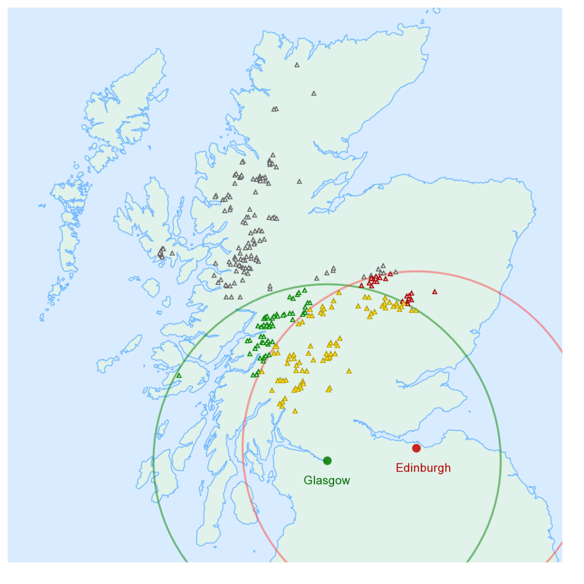
So does that mean that Glasgow is better?
I suppose in a way it does. And that won't surprise anyone. But the question surely needs to be explored further: how much better is Glasgow than Edinburgh? And why? To answer that we need more data. And lots of maps.
I happen to love maps and data, and I also happen to enjoy running processes over and over to collect lots of results. I used a piece of analytics software called Alteryx which makes it incredibly easy to run processes in batch, in this case 200 times. Here are the results, with some counters at the top and a graph at the bottom:

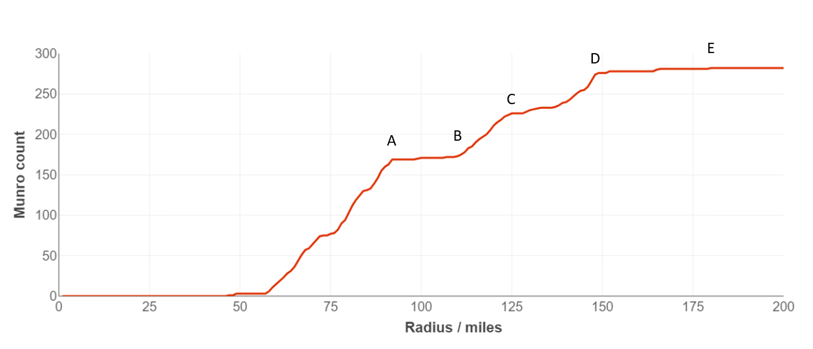
Edinburgh exhibits quite a curious pattern. Nothing much happens for the first 50 miles or so, and then the counter shoots up quite rapidly until just over 90 miles where we reach a total of 169 Munros. For the next 20 miles things are pretty flat: it's only once we hit mile 110 where things pick up again.
I've annotated these inflection points on the enlarged graph below. The flat-line or plateau between points 'A' and 'B' is of course due to the Great Glen with its famous geological fault and evident lack of terrain over 3,000 feet. Things pick up again between 'B' and 'C', and then level off at 'D' as we hit the 150 mile mark. Edinburgh attains its full complement of 282 Munros by mile 180, as the crow flies, marked 'E' below.
What about Glasgow?
The beauty of batch processing is that if we can analyse one place, we can easily repeat that process for another. Here is the equivalent animated map for Glasgow:

The pattern is different this time: Glasgow's Munro count climbs steadily from about mile 30 to 140, with an intriguing growth spurt between miles 66 and 72 thanks to the concentration of Munros around Ben Nevis and the Mamores.
Glasgow's count tops out at mile 177 when the most northerly Munro, Ben Hope, is reached.
Can we see both animations combined?
The real fun starts when we combine both distributions onto one map. You should by now be pretty familiar with the colour convention: green is for Glasgow, red for Edinburgh, and yellow for the area of overlap. Eventually, after 180 miles, everything will become yellow as the overlap grows, which is what you'd expect. The key here, however, is to study what happens before the point of total convergence.

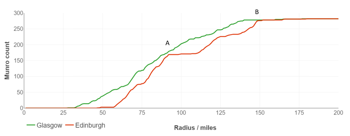
We can now see in much more detail why Glasgow is a deserving victor over Edinburgh when it comes to proximity to Munro summits. The green line in the chart below is consistently above the red line all the way up to mile 180 where they eventually converge.
Glasgow manages to hold off Edinburgh at point A (92 miles in), and from there it's an easy procession all the way to point B (150 miles) and then the finish line. In other words, there is no point in this distribution where Edinburgh outperforms Glasgow for Munro counts. This is a pity, for I was rather hoping there would be. It would make for an intriguing pub debate. It would also demonstrate how selective use of data can help to distort facts and manipulate arguments.
Surely you can find some kind of pro-Edinburgh slant?
Not without cheating! If I wanted to throw the results I could move Edinburgh's start point to the most north-westerly part of the city, and likewise shift Glasgow's to the southernmost extent. That might gain a mile or two's advantage for Edinburgh, but would be easily called out for its dubious ethics.
Otherwise, the best we can say is that "within a 92 mile radius, Edinburgh's Munro count is almost as high as Glasgows (169 vs 179)." Or we could say "There are as many Munros within 180 miles of Edinburgh as there are of Glasgow" which, while technically true, doesn't tell us anything useful at all.
Problem: who cares how the crow flies?
So far we've just looked at straight line distances from Edinburgh and Glasgow to the summit of each of the 282 Munros. We sometimes use the term 'as the crow flies' to describe straight line distances. They're quite useful for getting an overview of a geographic distribution, but they're less meaningful when it comes to climbing Munros.
Why? Because people don't fly like crows. Instead, they typically drive to the car park and then walk up the hill. Not all Munros have dedicated car parks, some just have lay-bys with limited space, but generally the guidebooks and websites tell you where to park for the easiest ascent. I've taken that information and put it in a spreadsheet which you can download here.
There many different ways to climb the Munros, and many different places to park depending on which path you take, which side of the mountain you approach from, whether you're combining several peaks into a 'big day', or indeed whether you're camping or bothying to tick off some of the remoter Munros. For the purposes of this exercise I've used the most popular start points according to a variety of guidebooks.
How many start points are there if doing the Munros by car?
According to my list (which isn't necessarily the best way), our 282 Munros can be climbed in 148 separate 'outings', using a total of 120 unique car parking spots. That gives an average of 1.9 Munros per outing (because it's very common to bag more than one Munro summit per outing), and an average of 2.35 Munros can be reached from each parking spot.
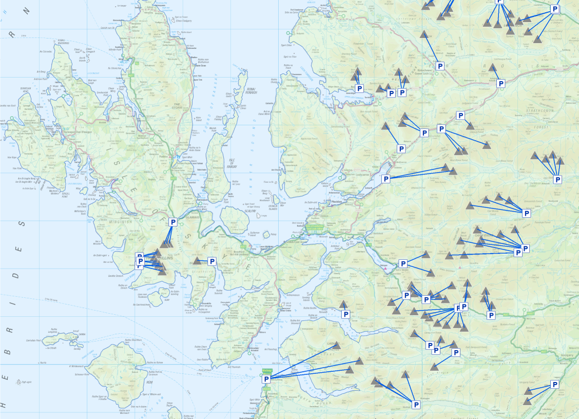
This map of Skye and the NW Highlands should make it slightly clearer: parking spots are shown with a blue 'P', Munros with a grey triangle, and the linking lines show how multiple summits can be accessed by the same parking spot (either in a single outing, or in multiple outings that just happen to use the same parking spot). Note how, in my list at least, the Knoydart hills at the bottom centre of the map below are accessed via Mallaig (and a boat to Inverie, presumably!).
So can we calculate the time it takes to get to each start point?
Absolutely, yes. This technique will be the focus for the remainder of this post. Instead of using straight line distance as our metric for comparing Glasgow vs Edinburgh, it might be more realistic to use a different dimension - time, specifically drive time.
Most readers will be familiar with route planning websites such as Google Maps which work out how long it takes to drive from A to B. The example above is the journey from Edinburgh to Mallaig, which is, in my list at least, the 'start point' for the three Knoydart Munros. I use the term 'start point' loosely there, because in the case of Mallaig you still need to catch a boat over Loch Nevis. But in terms of where you park your car, it's valid.
Luckily I didn't have to do hundreds of manual directions queries in Google Maps because it turns out that we can call the Directions API to retrieve the results programmatically. 120 start points for Glasgow and Edinburgh = 240 calls to the API, well within the free monthly allowance (although you do have to set up payment details to get the API key).
In addition to giving us drivetime and road distance, the response from the Directions API also gives us the geometry of the route, in a rather curious format called an 'Encoded Polyline'. Luckily for me, someone on the Alteryx forum has already posted a workflow to decode the polyline back into longitude/latitude pairs, so it was easy to retrieve all the data within Alteryx. My repeatable workflow looks like this:
Show me the results!
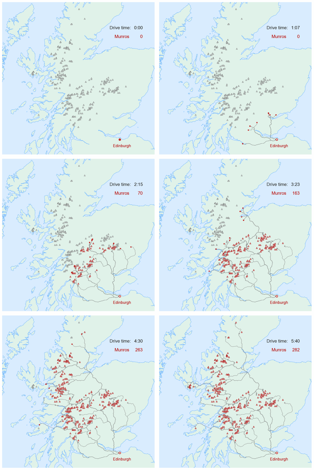
Let's take the 120 driving routes between Edinburgh and our 120 Munro car parks. The red circles below represent cars (initially lots of cars stacked on top of each other, but they diverge over time). When each car reaches a car park, the corresponding Munros are outlined in red. Eventually, after over 5 hours and 30 mins driving, all the start point car parks have been reached (according to general drive time predictions in Google Maps).
Remember that the time estimate is only for driving between George Square and the car park. It doesn't factor in time for breaks or indeed for climbing the Munro! The animation below tells you nothing about how long it takes to get from the car park to the summit, it just shows how the 120 unique car parking spots relate to the 282 Munro summits.
It's interesting that it takes longer to reach the furthest Skye Munro start points than it does to reach Ben Hope way up in the north. Watch also as the red dot slows down during the ferry crossing from Oban to Mull: Google knows this is a ferry, and since the Directions API returns times for each chunk of the route, it's possible to roughly depict driving speed in the animation below:
Here is the same idea, but for Glasgow. It's fun to watch the green dots spread out in search of Munros. We can quickly see that Glasgow has many more Munro car parks within, say, two hours' drive than Edinburgh, but as ever, the question is how many more?
This time we'll combine both Edinburgh and Glasgow onto one map, and we'll add some counters at the top. The symbology is slightly different this time: as before, the first 'car' to reach each car park determines the colour of the triangle symbol's outline. So if Glasgow reaches it first, the outline goes green; and if Edinburgh gets there first, the outline goes red. No radical changes there.
However, once the car park is reached by the second 'car' the triangle symbol is shaded in solid colour. Think in terms of winner and losers: if the Glasgow car wins the race to get to a car park, the Munro outline turns green. As soon as the Edinburgh car (the loser) arrives at the same point, the Munro will be shaded solid green. Thus you can tell how far the loser is behind the winner.
In some cases they arrive at pretty much the same time, in which case you'll barely notice the outlined triangle before it goes solid.
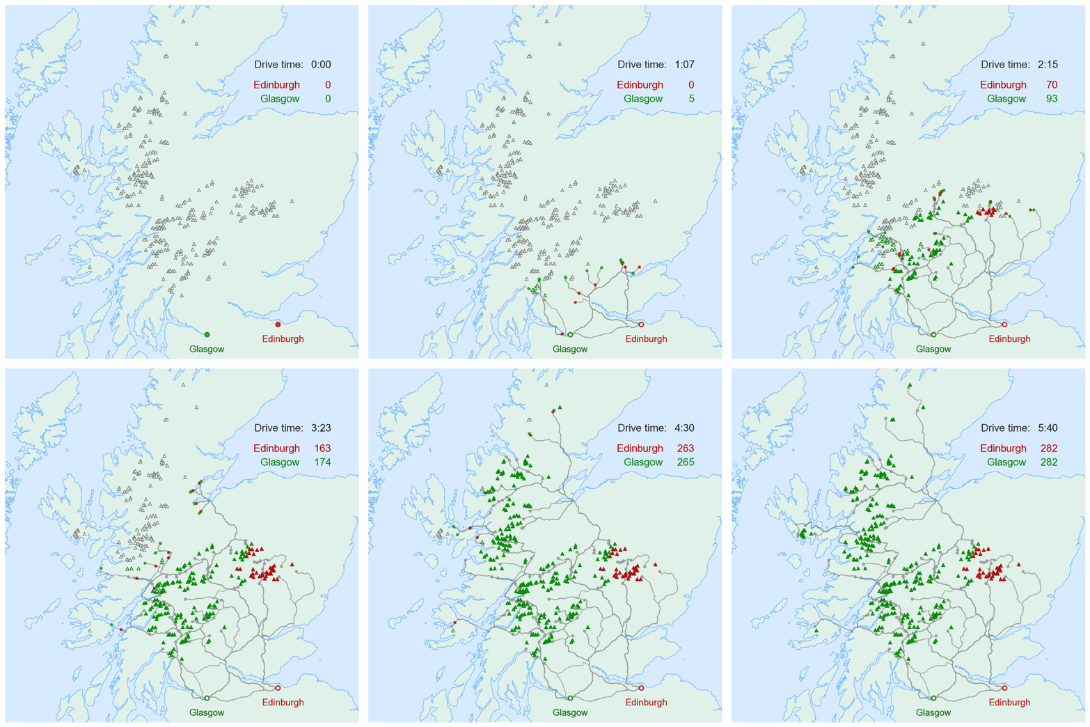
Animations are a fun and compelling way to present data - they really bring maps to life. Watch how the procession of 'cars' travels up the A9 before splitting north of Inverness. Also watch how much green there is - Glasgow appears to dominate when it comes to Munro accessibility. To find out by how much we need to see the graphs.
Show me some plots!
Here is the graph of drive time (in minutes) against number of reachable Munros. It shows a similar pattern to the graph of straight line distances to Munro summits shown earlier. Glasgow establishes a firm lead early on, with the first Munro car park reached after just 57 mins' driving (Beinn Ime and Beinn Narnain). Although it's closer as the crow flies, Ben Lomond takes slightly longer to drive to from George Square, at least according to Google Maps using 'typical' driving conditions, traffic etc.
What conclusions can we draw from the drive time results? Well, if you're into Munro-bagging, you're better off living in Glasgow than Edinburgh. From the maps and graph above we can see that a 100 minute drive from Glasgow yields enough start points to climb 35 Munros, wheres 100 mins' driving Edinburgh yields just one - Ben Chonzie, of course.
Increase the threshold to 120 mins or 2 hours, and the score is Glasgow 68, Edinburgh 24. At three hours' drive, however, Glasgow's lead narrows to 19 over Edinburgh (167 vs 148), and you can see in the graph above how the difference in height between the green line and red line decreases from about 150 minutes. Eventually, of course, after roughly five and a half hours of driving, the difference between Glasgow and Edinburgh is zero, because all the start points have been reached.
Who on Earth is going to drive 5 hours for a one day outing?
Good point. Only the most obsessive Munro-bagger is going to drive for more than say three or four hours each way. Don't forget they'd then need to do the walk and then drive all the way home - potentially a very long day, and noone wants to drive long distances when they're tired. So when it comes to day trips, most of us would rather not have to drive for more than a couple of hours each way.
In reality what that means is that most baggers quickly pick off the peaks close to home, and then start planning longer 'assaults' on more distant ranges, usually by staying overnight in the area. Perhaps a week on Skye in the summer, a long weekend in Braemar, an October week in Aviemore etc. So our model of single there-and-back outings breaks down once the distances and drive times get too high.
But the graph above is still instructive because it shows that, for two hours of driving each way, Glasgow is much better endowed with Munros than Edinburgh. If you want to do all the Munros you're still going to have to travel a long way, but you'll save time and petrol by living in Glasgow.
So the question really hinges on what we mean by 'better'. In this case, if our criteria is to count how many Munros can be accessed within one, two or three hours' drive of each city, then the data suggests to me that Glasgow is better.
To find out which is the best place in Scotland, which means analysing and comparing thousands of towns and villages instead of just two, come to my talk. It's free!
https://www.citizenticket.co.uk/events/datafest/munros/

